Hey pal you make everything here on the board too difficult— Instead of having a cluster migraine headache because of all these colors going around in your head just wear a rainbow brother and that’ll take care of your anxietySo, what you are saying is that you can only root for one team. LOL. I tend to adopt the home team of the state I live in, but I will always be a Husker fan first and foremost. I am a Dolphins fan, a Southern Miss fan, and a Nevada Wolf Pack fan, what colors should I consistently wear? Funny stuff indeed——.
-
You do not need to register if you are not going to pay the yearly fee to post. If you register please click here or log in go to "settings" then "my account" then "User Upgrades" and you can renew.
HuskerMax readers can save 50% on Omaha Steaks .
You are using an out of date browser. It may not display this or other websites correctly.
You should upgrade or use an alternative browser.
You should upgrade or use an alternative browser.
Uni reform
- Thread starter Sofa King
- Start date
Most of your posts are like visual diarrhea. No sense and hard to decipher. Maybe look them over before you hit 'post reply' next time. Would help us all.Hey pal you make everything here on the board too difficult— Instead of having a cluster migraine headache because of all these colors going around in your head just wear a rainbow brother and that’ll take care of your anxiety
Naturally teal husker gearSo, what you are saying is that you can only root for one team. LOL. I tend to adopt the home team of the state I live in, but I will always be a Husker fan first and foremost. I am a Dolphins fan, a Southern Miss fan, and a Nevada Wolf Pack fan, what colors should I consistently wear? Funny stuff indeed.
I
Now what other compliments pal are you holding back from telling meMost of your posts are like visual diarrhea. No sense and hard to decipher. Maybe look them over before you hit 'post reply' next time. Would help us all.
If you let out your emotional diarrhea you feel better palI
Now what other compliments pal are you holding back from telling me
The color on the walls of my Husker room!
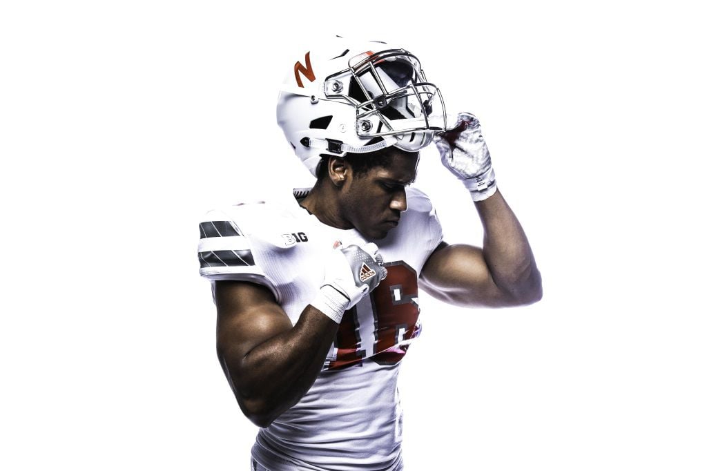
I'll hop in here. Yes black is an accent to any color, so is grey, that doesn't mean we need to wear both those colors. I simply don't think the uniform needs it, it doesn't add anything of value to the uniform IMO. The contrast between the red and white is perfect, why take away from it?
As for a redesign I think it's simple. Use the helmet as your base, that's what everything else gets designed off of. What does that mean? Single white stripe on the red jersey, single red stripe on the white jersey. Same for the pants. Clean, simple, and uniform. Option to wear all white, all red, or the traditional. Also miss the contrasting belt from the early 80's. There used to be a great concept by one of the guys over at sportslogos.net that pulled this off perfectly. Can't find it now.
Beyond that? I think HIO's idea of inverting the helmet every now and then is great. I also wouldn't mind the interlocking "NU" and the iron N from time to time.
And it cracks me up how many people always come in here *cough*cough*Pops*cough*cough* and crap on the idea that some people have opinions on this and care about it. BTW, TA certainly does and says he will be looking at making the athletic department cohesive and on point in it's branding and uniforms.
Oh, and a HELL no on the grey facemasks.
Because everyone has been clamoring for my opinion on this matter:
1. Get rid of the tight form fitting jerseys. Has anyone else noticed that our overall decline of on field success and lack of holding calls coincides with when the jerseys were changed to being skin tight? I'm not saying go back to the loose fitting tear away jerseys (though that would be great), but something with a bit more room to breathe and allow the officials see when we are being held.
2. Move the shoulder number back to the sleeve and remove the stripes (were not the 49ers or Ohio State).
3. No Huskers script - I've never cared for the abbreviation to begin with, but I've especially disliked the Huskers script logo since the Nineties. The Huskers script has been the number 1 issue in the limited amount of Nebraska apparel I purchase because they throw it on nearly everything.
4. The grey facemask would look great, but I am fine with any helmet design as long as it is plain white with just the san serif block N on the side and a single red stripe from front to back on the crown of the helmet.
The football team has a much better chance of a winning season in 2022 than just about every proposed uniform change mentioned in this dream thread. 
When y’all figure out what will or will not be worn
Have it introduced to the nation like this
Until then all ideas will be subject to secrecy.
So until then
Shhhhh
Or invite everyone and their mother to see it then ask they don't tell anybody.
These are my favorite alternates. View attachment 76436

Chrome ones were my favorite alternate uniform. Everything else was either such a slight variation you could hardly tell they were different, or were so ugly it made me want to drop Adidas.
1. That's the way they make jerseys now. You aren't going to see that change, it is the industry standard now.Because everyone has been clamoring for my opinion on this matter:
1. Get rid of the tight form fitting jerseys. Has anyone else noticed that our overall decline of on field success and lack of holding calls coincides with when the jerseys were changed to being skin tight? I'm not saying go back to the loose fitting tear away jerseys (though that would be great), but something with a bit more room to breathe and allow the officials see when we are being held.
2. Move the shoulder number back to the sleeve and remove the stripes (were not the 49ers or Ohio State).
3. No Huskers script - I've never cared for the abbreviation to begin with, but I've especially disliked the Huskers script logo since the Nineties. The Huskers script has been the number 1 issue in the limited amount of Nebraska apparel I purchase because they throw it on nearly everything.
4. The grey facemask would look great, but I am fine with any helmet design as long as it is plain white with just the san serif block N on the side and a single red stripe from front to back on the crown of the helmet.
2. I like the shoulder stripes, personally.
3. Agree heavily with this one! Not a fan of the script Huskers. It's okay to put on some stuff, but has no business being on the jersey or helmet. That being said, don't change the N on the helmet either.
4. I agree, less is more with the helmet. It is a sharp helmet as it is, no need to tinker with it.


