• You do not need to register if you are not going to pay the yearly fee to post. If you register please click here or log in go to "settings" then "my account" then "User Upgrades" and you can renew.

HuskerMax readers can save 50% on  Omaha Steaks .

Locked due to no posts in 60 days. Report 1st post if need unlocked Best/Worst Football Uniforms - Red & White - Not so fashionable

Status
Not open for further replies.

IMfanFORnu

Scout Team
5 Year Member
Article from "Fashion experts" regarding College Football uniforms. Disagree with many of the comments. Obviously ranked by "fashion experts" and not football fans. Article from Wall Street Journal:
How Fashionable Is Your College Team? An Expert Panel Rates Football Duds from Stylish to Garish; Calling Clemson an 'Eyesore'
http://online.wsj.com/article/SB10001424052970204464404577114863448822548.html?mod=WSJ_hpp_editorsPicks_3

Shear proof of the GROSS LACK of FOOTBALL KNOWLEDGE ---- while dissin' the RED & WHITE uni's they failed to mention the college football STANDARD of the Red and White (or Scarlett and Cream), ----- dear 'ol Nebraska
The "Red and Whites": Red and white usually makes a nice color combination, the panelists said, but not in college football, where it's overdone. About a dozen teams, including Wisconsin, Indiana and North Carolina State, employ a nearly identical look: basic red top, white pants. The panel was not pleased. After examining some of these looks, Gensler asked: "Is the point of this article to address how overall boring the uniforms are?"
 
Last edited:

Colorado, Oregon, Maryland and VaTech were 4 of the 5 favorites? Enough said ... but I do wonder where they found the good taste to include Michigan's unis, which are about as boring as ours or PSU's.


Colorado, Oregon, Maryland and VaTech were 4 of the 5 favorites? Enough said ... but I do wonder where they found the good taste to include Michigan's unis, which are about as boring as ours or PSU's.

though many polls and opinions over the years have shown that a very large number of people consider michigan's helmets to be the best in college football.... and also, the maize and blue is a fairly uncommon color combination.
 
though many polls and opinions over the years have shown that a very large number of people consider michigan's helmets to be the best in college football.... and also, the maize and blue is a fairly uncommon color combination.

I've always liked Michigan's uniforms. The school and the team? Not so much.

Colorado's are cool, but if they like that color scheme I would go with Mizzou's - much better logo. Oregon and Va. Tech have a few cool combinations including their all whites, which I'm not normally a big fan of.
 
Must have been a slow news day for the writer. There are some team colors I like better than others. Having gone to Arizona, I always liked their blue and red better than red and white at NU or Wisconsin. However, there isn't much choice for us, so I live with it and "bleed" red along with the rest of you. What I do hate is the "modernizing" and rotating of unis like Oregon or Maryland. Give me the white pants and red jersey any day. In the end, what really counts is what is INSIDE the uni.
 
Last edited:
Time for a little art theory.

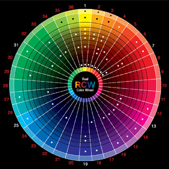
Below, you'll see a color wheel. Typically, basic design teaches that high contrast color schemes are most desirable, especially for sports uniforms. The simplest way to do this is to pick colors that oppose each other on the wheel.

Real_Color_Wheel_475.jpg


For example, you'll see that the family of "blues" and family of "yellows" are opposing. This is what gives Michigan such a great color combo.

The addition of whites, blacks and grays can also help you use colors that are "close" to each other. For example, consider Miami. The orange and green are somewhat close on the color spectrum, but by adding a healthy dose of white to their uniforms, they make it work.

Neighboring colors can work, such as the Blue-Green mashup of Tulane or the Green-Yellow combos of Oregon. You try to avoid is using 3 neighboring colors (red, yellow orange) or use more than 3 main colors because the design gets too scattered looking.

Part of the reason that everyone hated Maryland's new uniforms is that they basically contrasted two already high-contrast patterns; red/white and yellow/black. And while it looks great on their state flag, it was gimmicky on a football jersey.

Coming back to the article, I tend to agree that the Red/White combo is over played. Nebraska, Wisconsin, Ohio State, Oklahoma, Washington State, Utah, Stanford, NC State, Alabama, Arkansas, Rutgers and Louisville all use some combination of Red/Maroon/Scarlet/Cardinal and White. And those were just the first teams that flew off the top of my head.

But maybe they should have stopped to consider that so many schools use Red/White because it's a great color combo.
 
Last edited:


Time for a little art theory.

Below, you'll see a color wheel. Typically, basic design teaches that high contrast color schemes are most desirable, especially for sports uniforms. The simplest way to do this is to pick colors that oppose each other on the wheel.

Real_Color_Wheel_475.jpg


For example, you'll see that the family of "blues" and family of "yellows" are opposing. This is what gives Michigan such a great color combo.

The addition of whites, blacks and grays can also help you use colors that are "close" to each other. For example, consider Miami. The orange and green are somewhat close on the color spectrum, but by adding a healthy dose of white to their uniforms, they make it work.

Neighboring colors can work, such as the Blue-Green mashup of Tulane or the Green-Yellow combos of Oregon. You try to avoid is using 3 neighboring colors (red, yellow orange) or use more than 3 main colors because the design gets too scattered looking.

Part of the reason that everyone hated Maryland's new uniforms is that they basically contrasted two already high-contrast patterns; red/white and yellow/black. And while it looks great on their state flag, it was gimmicky on a football jersey.

Coming back to the article, I tend to agree that the Red/White combo is over played. Nebraska, Wisconsin, Ohio State, Oklahoma, Washington State, Utah, Stanford, NC State, Alabama, Arkansas, Rutgers and Louisville all use some combination of Red/Maroon/Scarlet/Cardinal and White. And those were just the first teams that flew off the top of my head.

But maybe they should have stopped to consider that so many schools use Red/White because it's a great color combo.


Good post. I like the Huskers uni's and assume most fans do - to heck with what anyone else thinks.


Any college team use the old tried and true colors of Black and White, like my Lincoln Northeast High School Rockets!?!

Interesting... hadn't thought about that combo before...Northeast is the only team I can think of that uses black and white! (I'm a Southeast alum ... black and gold are a bit overused, however.) :)
 
Time for a little art theory.

Below, you'll see a color wheel. Typically, basic design teaches that high contrast color schemes are most desirable, especially for sports uniforms. The simplest way to do this is to pick colors that oppose each other on the wheel.

Real_Color_Wheel_475.jpg


For example, you'll see that the family of "blues" and family of "yellows" are opposing. This is what gives Michigan such a great color combo.

The addition of whites, blacks and grays can also help you use colors that are "close" to each other. For example, consider Miami. The orange and green are somewhat close on the color spectrum, but by adding a healthy dose of white to their uniforms, they make it work.

Neighboring colors can work, such as the Blue-Green mashup of Tulane or the Green-Yellow combos of Oregon. You try to avoid is using 3 neighboring colors (red, yellow orange) or use more than 3 main colors because the design gets too scattered looking.

Part of the reason that everyone hated Maryland's new uniforms is that they basically contrasted two already high-contrast patterns; red/white and yellow/black. And while it looks great on their state flag, it was gimmicky on a football jersey.

Coming back to the article, I tend to agree that the Red/White combo is over played. Nebraska, Wisconsin, Ohio State, Oklahoma, Washington State, Utah, Stanford, NC State, Alabama, Arkansas, Rutgers and Louisville all use some combination of Red/Maroon/Scarlet/Cardinal and White. And those were just the first teams that flew off the top of my head.

But maybe they should have stopped to consider that so many schools use Red/White because it's a great color combo.

There is no white on your color chart which makes us "off the chart flippin awesome".
 
Last edited:

I must be getting old. Never thought I'd see an article regarding stylish fashion with reference to college football. Really must be a slow news day.
 
Status
Not open for further replies.

GET TICKETS


Get 50% off on Omaha Steaks

Back
Top